Feeds:
Posts
Comments

Archive for the ‘ArtPlantae Books’ Category

9) Any advice on drawing and painting branches? I have so much trouble with this.

Wendy Hollender: Study the branches closely, first without any leaves. Winter is great for this. Draw them with all the detail you would put in a flower. Pay attention to how they change direction and thickness. Lay a branch next to a straight edge for comparison.

Rayma Kempinsky Peterson: Branches are a challenge. I usually draw them in early in the composition stage. Many of the trees in Western Canada are not brown. I draw them and leave them white for a time. Then as the painting progresses, I fill them in leaving a lot of the white. Aspen and birch barks are especially light-colored. Aspen bark is often light green. Remember that many branches and twigs have nodes as important parts of their anatomy. Often a twig will be straight in between nodes.

Louise Smith: When I have long and smoothly-curved branches or stems, I use a large French curve in my final drawing version. I will then lightly paint an outline that follows the drawn line which will serve as a “dike” once I get on with painting. Form in small spaces is likely to be drybrush and wash, wider branches may be all wash and glazing. I always use morphological information that the plant supplies to help describe form.

Return to Using Photographs

Continue to Paper

Back to Index

Read Full Post »

10) Do you use a lot of different papers? If so, which paper do you like best?

Kathy J. Imel: Yes. I have one set of different papers for watercolor, graphite and colored pencil. The common element is that it is hot-pressed and fairly heavily sized (if for watercolor). I use a completely different set of papers (with more “tooth”) for pastel. My current favorites are Wallis sanded pastel paper and black Stonehenge printmakers’ paper.

Robin Jess: For my watercolor paintings, I used Arches 140 lb hot press exclusively. However, if I were to do an image for commercial use now (other than fine art prints) I would use a whiter paper, as sometimes the tone of Arches can be an issue. I know that backgrounds now can be removed digitally, but to avoid that, I would try a whiter paper.

Mindy Lighthipe: I use Fabriano Artistico 300 lb Soft Press for Watercolor, LanaAquarelle Hot Press 300 lb for gouache.

Julie Sims Messenger: I have tried lots of different papers but keep going back to Arches watercolor paper because it is so forgiving (for me). Because I work the paper surface with many layers of glazing, I need a surface that won’t degrade easily. I will use the 140 lb for more delicate subjects because the surface is very smooth and I will use the 300 lb for more substantial subjects like woody plants because the surface has some slight tooth, even though it is hot press.

Scott Rawlins: At present, much of my colored pencil work is done on illustration board or coquille board. Because I use a great number of materials, I also use a number of grounds regularly – e.g., Denril film, handmade paper, mat board, various clay-coated surfaces and printer paper for digital work. In any given year I probably use 10 different surfaces.

Susan Rubin: Having experimented with numerous papers over the years, I gravitate toward just a few that will consistently give me the results I like. For both colored pencil and graphite, I like Fabriano Artistico 140# hot press watercolor paper, Saunders Waterford 140# HP WC if I want a cream-colored surface, or Rising Stonehenge, white or black. I do a good deal of my work on double-frosted Mylar as well.

Dolores R. Santoliquido: Early on I experimented with using different papers. I use a dry-brush technique that requires a very tough, exceptionally smooth surface. The paper I have worked on for over 20 years has been Arches 140 lb. hot press paper. Unfortunately, in recent years the surface of the paper has been pilling and I am in the process of seeking a paper that works as Arches did a few years back.

Return to Drawing Branches

Continue to Drawing Veins

Back to Index

Read Full Post »
11) How do you like to draw veins?

Bobbi Angell: I like to draw them as accurately as possible, since they are important for identification. I doubt that is what you are asking, but once you start paying attention to patterns they become quite fascinating to draw no matter the technique.

Margaret Best: I love painting leaves period – veins are just a part of the pleasure.

Beverly Duncan: Careful observation first! One must understand the veining pattern of each specimen and how light on the specimen defines the veins.

Jean Emmons: For main veins, I save the white paper/vellum and paint around them. They always need some repair work (lifting) at the end. It’s good to remember that main veins have highlights, core darks, and cast shadows.

Sally Jacobs: I do a leaf rubbing to get an accurate picture of the venous structure. Even then, when I draw the veins, I have a real specimen in front of me to guide the drawing.

Mindy Lighthipe: I lift them out with a chisel brush.

Sherry Mitchell: I paint the veins of leaves by NOT painting them, really, at least not right away. If the vein is lighter than the majority of the leaf, then it is really “painted around,” with the vein being left out until the leaf is mostly complete. If the vein is darker than the majority of the leaf, I will block it in with a very fine brush, and then bring the paint up to it, so that it remains as an accent, adjusting the depth of colour as appropriate.

Return to Paper

Continue to Arranging Your Palette

Back to Index

Read Full Post »

12) How do you organize your palette? Do you separate non-staining transparent colors from staining colors?

Margaret Best: I arrange my pallets by colour groups. I know which are the stainers but do not separate them.

Olivia Marie Braida Chiusano: I organize my paints according to each section of the painting. I use only single pigment paints and primarily glazing of layers to achieve depth of color. Pigments that are mixed or desaturated are kept in separate dishes. Lifting colors are never included in a “mix” or “between” glazing layers. Opaque paints are used with care and strategy to achieve the desired effect. Everything is worked out in advance with limited range of pigments.

Jean Emmons: I use a modified color wheel on a butcher tray. I try not to use staining colors, because I change my mind (and my colors) all the time. Staining requires a commitment. I keep the slightly opaque watercolors separate, because they’re not so good for building initial glazes, but terrific for knitting things together (covering all sins) later.

Sally Jacobs: I use the Michael Wilcox palette to organize color. I don’t separate colors by non-staining versus staining.

Robin Jess: I am embarrassed to say that I don’t really know much about staining vs. non-staining. I never took a class in watercolor, but I have learned a lot about colors from Carolyn Payzant’s Color Curriculum article in the ASBA newsletter. I use an enamel butcher’s tray and I organize my colors as to the spectrum. I often put clear tape on the inside of the tray’s walls with the name of the paint next to the patch of it. When I mix a color I write down what I used and the general proportions so I can make it again. I do note the permanence.

Return to Drawing Veins

Continue to Mixed Media

Back to Index

Read Full Post »

13) How do you match colors using mixed media?

Scott Rawlins : For much of a rendering, the different media are used for different effects – so they enhance one another, rather than match exactly. For example, a layer of pastel dust is used to create a base hue, and other media (such as colored pencil or graphite) are used to deepen values, saturate areas or create shadows. A lemon yellow watercolor may be used with a goldenrod colored pencil to achieve the complex shifts of colors on a single flower petal. I don’t aim to match the colors, just make sure they work together well. (Note: Graphite can take on the hue of surrounding areas, in small patches. Sometimes when I need to darken an area of watercolor, I will “tint” the light area with graphite – and though the hue is not matched, the value is, and it is difficult for most people to discern the difference.)

Dolores R. Santoliquido : Given that I use both acrylic paint and colored pencil, I have a wide color palette to choose from. When starting a painting I use colored pencil first and lay in a thin layer of color, duplicating the lightest colors initially, the medium colors next and the darkest colors last. I match colored pencil colors to the color family of the area I am painting. I also overlay one color over another color if necessary. After I have completed the first layer of colored pencil, I overlay light acrylic washes to intensify the colors of the subject. The acrylic color reinforces the specific color chosen for the specific area being painted. I continue the process of alternating thin layers of colored pencil and acrylic washes until I reach the saturation level matching the subject I am rendering.

Return to Arranging Your Palette

Back to Index

Read Full Post »

Thank you to those of you who submitted questions to the panel of artists participating in the current “Ask The Artist” session.

Return on June 24th to hear how the panel responds to questions such as:

  • Because botanical art is so representational, how far can you stretch a composition in botanical art?
  • Once you really learned watercolor, did you ever go back to graphite, ink or colored pencil?

See you next week!

Read Full Post »

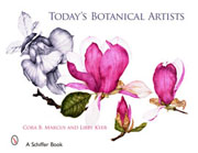
Cover, Today's Botanical Artists
Submit your question(s) to the current “Ask The Artist” panel. This panel consists of 25 contributors to Today’s Botanical Artists.

Send your question(s) to AskTheArtist@artplantae.com.

Go to http://artplantaetoday.com on June 24, 2008 to read the panel’s responses to your questions.

Read Full Post »

« Newer Posts - Older Posts »