It is clear that Botanical Drawing: A Beginner’s Guide has inspired you to draw plants.  Wendy is very appreciative of your interest in her new book and thinks the questions you submitted last week are excellent! Wendy’s responses to your comments and questions follows:
Thanks for taking the time to answer questions! I have just begun the workbook, but love it so far.
I am glad to hear that you are actually using the workbook and enjoying the process! This is what it is all about. Practice and enjoyment will certainly lead to good results.
In general, for the deep shadows on the green leaves, do you use various shades of gray pencil or do you use the complementary color — a shade of red?
I usually work first with an underlayer of a dark sepia pencil which is the equivalent of a graphite pencil shade. It is a brownish, grayish color that can go from very dark to very light. I do my drawing and toning first with this to about 20 percent coverage, then I start to feed-in green tones, which blend together. I add lighter tones and more yellowish greens in my light areas as well. I use the complement when I want to dull a color. If my green feels too bright, I will layer in some red or orange.
When you are drawing/painting white flowers (letting the white paper be the basis for the white flower) are you using just grays for the shadows/modeling on the petals/sepals or are you using other “cool” colors?
I model white petals with either tones of cool gray or sometimes-even warmer grays. It is important to still have very dark areas to define the structure, but then the transition to lighter tones happens quicker on white flowers. Sometimes there might be a hint of lavender in the grays. The most important element is always defining the structure of the flower and the light source using the right range of tones.
When I have photographed my colored pencil drawings, the white background tends to come out a shade of gray in the digital print. How can I correct this without resorting to trying to correct it with Photoshop?
I prefer to scan my original artwork rather than photograph the work. The resolution is much better and so are the colors. That said, even with this method, white backgrounds can be a problem. Sometimes using the magic wand tool in Photoshop can easily remove the background, but often it is necessary to select the entire background for the purpose of changing the tone with several different techniques. The sharper your edges are, the easier the process of separating out the background, but it still has to be done in Photoshop. Otherwise, you will be adjusting all the colors in your artwork which you may not want to do. One idea is to try and adjust contrast on the whole drawing. Unfortunately, I have not found a technique that doesn’t require some work. Changing and removing backgrounds is not too difficult once you find a technique that works well for your work.
Do you sketch at botanic gardens much or do you usually have a plant in front of you at your studio/home to work from?
I often work on location at botanic gardens, in the rain forest, other tropical locations, and at local parks in my neighborhood. My favorite method is to have a table and chair set up somewhere close to where the plant is growing so I can work comfortably. I take a cutting to study closely, is possible, but I will refer back to the plant as it grows for more information on how it looks naturally. I do bring plants back to work in my studio, but if I can capture the plant in it’s natural setting before it is wilted or dramatically changed, I prefer that method.
How much of your work (estimated) is done in colored pencil?
When I first started doing botanical work I used colored pencil primarily for note taking and for quick samples of the colors in the specimen. As I developed my technique more and more, I started using colored pencil in finished drawings and paintings. Now I would estimate that 80 – 90 % of my work is in colored pencil. I sometimes use watercolor as undertones and for backgrounds, but do all my detail in colored pencil.
Do you get commissioned to draw botanical subjects?
I do get commissions for botanical subjects from a variety of individuals
and for commercial purposes as well. I have been commissioned to illustrate plants growing in a particular garden or park, as well as illustrations for use on botanical labels or for magazines and other publications. Commissions also come in the form of, “Can you draw a daisy for my mother’s birthday, it is her favorite flower?” I also take my finished drawings and design silk scarves from them. I have them digitally printed on silk. The results are very close to the original drawings.
How do you paint two very dark flowers, for example, one behind the other and distinguish between the two of them?
Even when rendering a dark flower there still needs to be a range of tones from very dark to very light. I will often make the flower that is in front lighter on the edge that is closest to the flower behind for contrast. I will also make the flower behind darker, as it is most likely in shadow. Bright highlights will be reserved for the flower in front.
The edges of my flowers tend to be messy. I can’t get clean lines. How do you achieve your clean edges?
I achieve clean edges towards the end of a drawing by switching to the Verithin pencils by Prismacolor. They are a harder pencil and can fill in the rough edges quite nicely. I also sharpen all my pencils often so I can get clean sharp edges, but it is important not to outline! Outlines tend to flatten form, whereas a dark edge turning lighter as it describes the form heading towards the light will look 3-dimensional.
I don’t know where to start when the plant (or flower) I am drawing has lots of leaves or petals. After a while I seem to lose track of where I am at. What is the best way to draw them?
I like to draw the simple shape of the flower or plant first, defining a center axis where the petals and leaves will radiate from. I will also “prune” a plant while planning a composition, eliminating some leaves that I don’t feel contribute to the drawing. On a complex flower, I draw the center vein of each petal first, then attach it to the form, and build up my flower this way. It is more important to draw the petals radiating correctly from the stem, than to copy each petal exactly as it is on your particular flower. I tell my students, “This is not a crime scene.” It is more important to show an overall understanding of a plant’s structure than to describe each and every petal exactly as it is on that one particular flower. A trick is to study the edges of the petals closely so you can draw them accurately, but you don’t have to study every petal to do this!
What is your approach to keeping your work looking “fresh” and “bright”?
Good contrast in lights and darks helps to make a drawing look bright and in focus. A clear light source is important as well. It is always about tone and form first for me, and color second, even though in the end it is the color that we notice. I try to match my colors exactly from nature for the local color of the specimen, but then I do whatever I need to in the shadow areas and highlighted areas to describe the 3-dimensional quality of the form.
How do you achieve true values in watercolor, rather than a pastel-y watered down look?
To achieve true values and good contrast in watercolor it is necessary to work in layers and use enough dry brush and opaque paint towards the end for sufficient contrast.
Have you tried using your book with children?
The lessons in my workbook were developed over several years of working with many groups of students. I have worked with students of all ages including young children. This past fall I did some classes with third and fourth graders in a Brooklyn Public school. I was describing light source on crab apples and demonstrating my technique to the group. When I described the light source and the highlighted area a little boy shouted out, “Oh, that is where the sun is hitting the apple.” It was clear that he understood exactly what I was trying to demonstrate. My technique for teaching is the same, regardless of the age or ability of the student. I try to teach step-by-step lessons that build on skills one at a time, from a simple concept to a more complex one, allowing students to work at their own pace and moving on only after they understand the basic concept.
_____
ArtPlantae Books would like to thank Wendy for taking the time to chat with us and for signing copies of her new workbook. Special thanks go out to you, our readers, whose participation in this event has created a learning environment from which many can benefit.
Visit Wendy Hollender’s website at DrawingInColor.com. Wendy’s paintings can also be viewed in the recently published book, Today’s Botanical Artists by Cora Marcus and Libby Kyer.
UPDATE 2015:
Wendy’s second book, Botanical Drawing in Color: A Basic Guide to Mastering Realistic Form and Naturalistic Color can be purchased online.
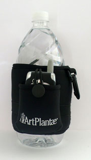 pen and your pocket watercolor set. You gather your art supplies successfully, but then think of your keys, money, driver’s license, cell phone, and water bottle. “Can’t I leave the house without strapping a bag over my shoulder?!”, you ask.


